American Diabetes Association
User Experience, User Interface, Marketing, Fundraising,
User Experience, User Interface, Marketing, Fundraising,
Helping those living with diabetes thrive
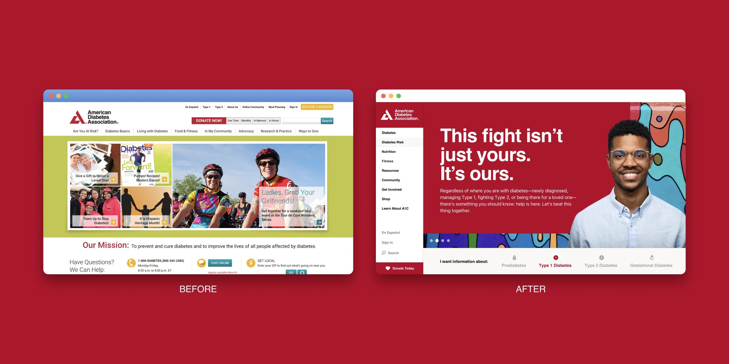
The American Diabetes Association (ADA) approached my team to overhaul their website design that was over six years old. That’s six years of developments in UX discoveries, UI trends, scientific advancements, compiled resources, and, most importantly, six years sub-optimal experiences for a organization dependent on the kindness and donations of its visitors to survive.
Our aim with this much-needed redesign was to instill hope to those who need it most. We prioritized updated look and feel, ADA compliance, site-wide audit and card sorting to improve the user journey, and a templatized page creation system for the site to outlive my personal involvement.
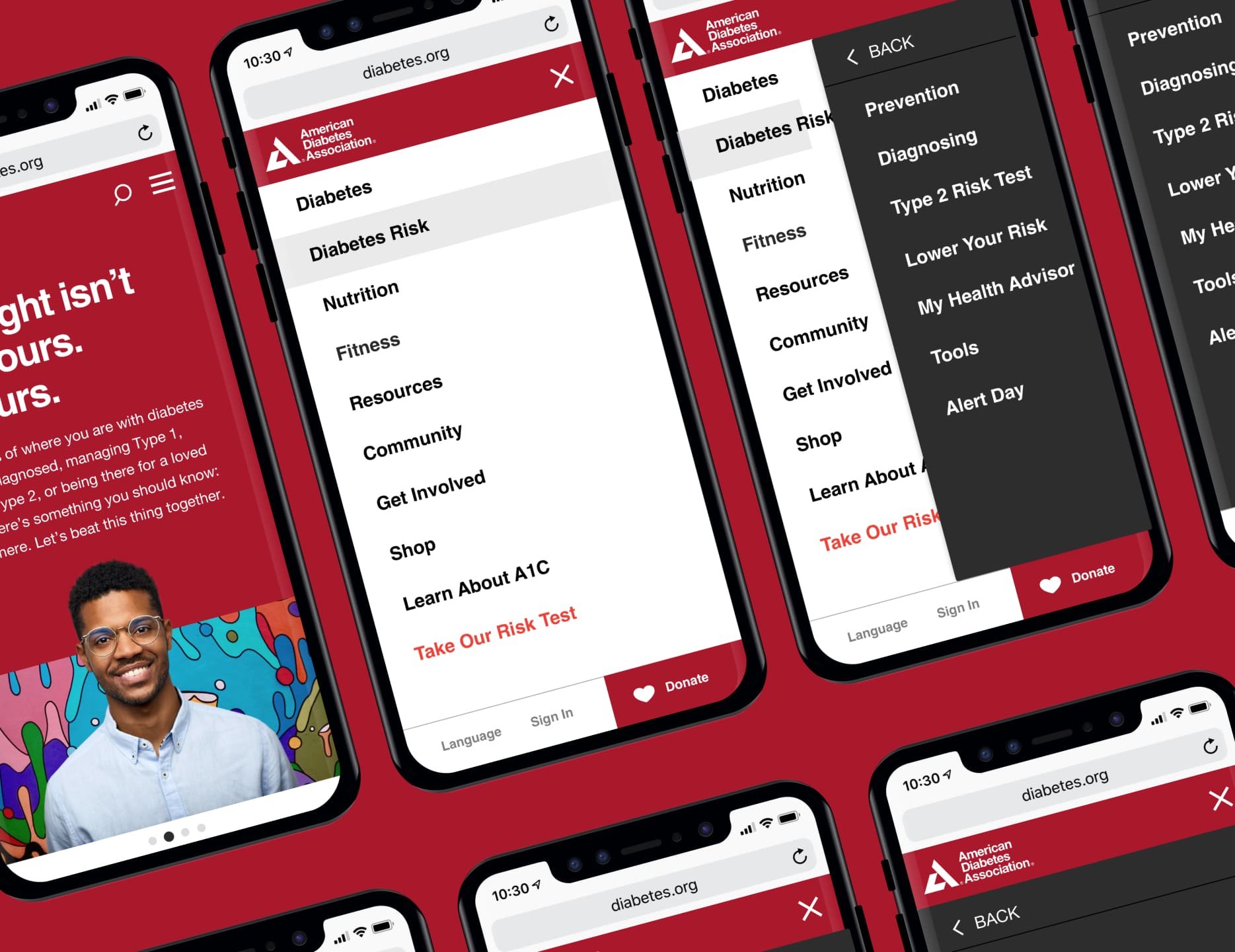
The end result was a website that was more navigable from desktop to mobile. Site-wide copy was revisited to increase scanability and lowered to an eight grade reading level to broaden accessibility. And lastly, updated imagery throughout added much-needed relatability and hopefulness that was lacking.


Future-proofing a pattern library
A site-wide audit allowed us to create a prioritization hierarchy of page sections; allowing us to allocate time and resources to the most frequently required components.
The end result was a website that was more navigable from desktop to mobile. Site-wide copy was revisited to increase scanability and lowered to an eight grade reading level to broaden accessibility. And lastly, updated imagery throughout added much-needed relatability and hopefulness that was lacking.

